top of page
comparison
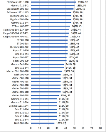

Resident Beds Comparison
Above is a graph that displays the huge variance between the number of resident beds to each RA. Using the lowest number of beds as the 100% mark, one can easily see how certain communities have over double the amount of resident beds.

RA to Resident Ratio Across Campus
Above is a table that illustrates the number of RAs to residents per community. Each area of campus is different in the amount of RAs that are placed there as well as the amount of residents that can reside in that community.
bottom of page